
2021 UI / UX Design
Cordino App Product Design
Collaboration your way.
Project Context
Page Contents
01. The Problem Statement
02. The Roadblocks
03. Persona Development
04. Story Mapping
05. Information Architecture
06. Low-Fidelity Wireframes
07. The Solutions
Reflections
01.
The Problem Statement
At the start of this project, the company was utilizing a social platform intended for cross-functional and lateral company transparency among employees. Their development team created plugins to silo the platform engagement appropriately, while retaining the interaction functionalities. Our agency provided support for this platform, so using our insight of common issues within the platform we were to create an internal social system to allow control of a multitude of organizations from a single login and control panel, when the organizations were technically separate from each other.
02.
The Roadblocks
1. I operated as a single person design team with conceptual support from a single person documentation team. I was required to fill the role of a product design lead, lead UI/UX designer, and client point of contact on a condensed timeline.
2. I was required to design a set of feature to allow for user journeys to have different experiences within different organizations, while remaining in the same user session without any concrete data inputs or technical specifications from the development team.
03.
Persona Development
For this product, we were asked to solve the problems of two types of users at the same time. The standard users wanted an frictionless experience for consuming content and the admin users wanted a streamlined way of managing content. In order to accurate address each user’s needs, we developed two personas within this organization.
Standard Users
Admin Users
04.
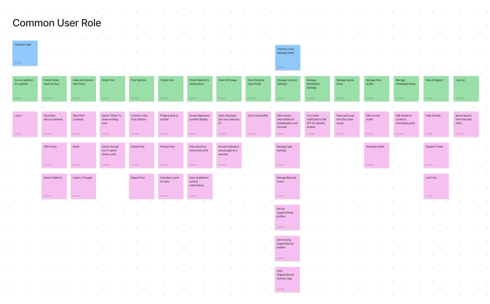
Story Mapping
As an agency, we provided customer support for a platform that the client was using. Through this, we had empirical insight into what the user journey was and namely the key problems they were facing.

05.
Information Architecture
Due to the pace and budgetary constraints of this project, I took a holistic approach to compiling an information architecture by utiziling the structure of the document to display to the client how feature sets would work together. The client had access to this file to view and make requests throughout the project. Any feature that would creep would be added to an icebox in the project story map to be able to work towards a complete version of the product.

06.
Low Fidelity Wireframes

07.
The Solutions
I had three main focus sections for the product in mind – the home page, content management, and platform permissions. It was essential that the consumption experience was streamlined in a way that features can be layered in order of priority.
Amplify the Home Page
For the home page, I focused on adding a dynamic and visual filter bar to bring the two elements that a standard user utilizes most to the highest level. In other platforms used by this organization, a large stress point was having to navigate into nested menus to access the main features throughout the day. To add further customization, it was important that the users could organize their groups and organizations based on their perceived priority.
Simplify the Consumption Experience
To address this issue, I intentionally minimized the features in this platform and the ways in which they can be accessed. I nested features only when a necessary distinction was needed between user roles in which that page would not be enabled for a standard user.
Streamline Management Permissions
We brought the basics of common social platforms over and tied them in the backend in a way that centralized all permissions into three high level categories. At multiple points within the platform, an admin view would give access to a filtering bar to allow an admin user to modify all settings from a single destination within the application at an “Organizational” level, a “People” level, or a “Groups” level. Cascading prinicples would keep the platform consistently inline with company practices.
*Generic images and names have been inputted for client confidentiality.
Amplify the Home Page
Simplify the Consumption Experience
Streamline Management Permissions
.Reflections
- How to Get Creative on Data Collection: This project was unique in the sense that the client was adamantly against research in the claims that they knew the intuitive nature of their user. I worked with minimal data and had to collect key decisions conversationally. Since the completion of this prototype, user research surveys have been conducted to better understand the true user needs and know what features to continue working on.
- Controlling Appeal & Importance: The client was well-versed in how their organization ran, and therefore the elements that pulled their attention strongly had significant value to them. However, oftentimes this minut details that were imperative to them did not hold much weight in the functionality of the product. In this project, I gained experience on how to mold what the client wanted in specific moments to work better for the product long term.
- Adapting my Workflows: In preparing for my transition to design, I dove deep into user stories, information architecture diagrams, low fidelity wireframe verbiage and how the design process should work as a whole. The fast nature of this project gave me experience in how I can stay organized and proper, without inhibiting the client expectations.

Admin Portal Interface Design
Developed a web based user interface for an existing developer backend system that manages company memberships, event permissions, and users.

Whiskey By John Howie Web Design
Designed and built a new website for a Seattle-based steakhouse launching a whiskey bar and lounge.