
2021 Graphic Design
Sydnee.App Brand Guidelines
The one-stop shop for client marketing.
Project Context
In the world of digital marketing, agencies and freelancers often have to wear many hats and juggle evolving pieces of their businesses and client businesses. Stakeholders for Sydnee desired to create a hub to assist freelancers in managing and growing their marketing based digital client relationships. With a vague product vision, my goal was to create a fresh, captivating brand identity that would feel energizing but not visually overwhelming when presenting clients with dense, valuable information.
Client / Stakeholders
Team / Independent
Role / Graphic Design
Tools / Adobe Illustrator
Duration / Phase 1 – November 2021 (3 Weeks)
Page Contents
01. Visual Concepts
02. Color Palette
03. Color Matrix & Accessibility
04. Logo Concepts
05. Typography & Hierarchy
Reflections
01.
Visual Concept Presentation
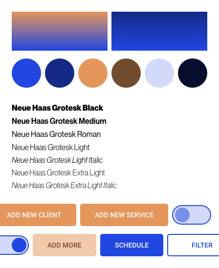
To start the project off, I generated three visual concepts based on color trends that were current in the tech space at the time. The color blue has been a power player in many social and software type platforms, so while the stakeholders wanted to stay familiar to potential users it was important to differentiate early in the process. The goal for the product look and feel was for it to be modular and “shoppable”. However, due to the large amounts of text that would be housed within each of these modules, it was critical that the colors were malleable for either design or text legibility.


02.
Color Palette
Once a visual concept was selected, it was formalized into a color palette to identify visual hierarchy. This included identifying a primary color with a primary variant, a secondary color with secondary variant, a surface color and a background color for the brand. The color palette was organized with hierarchy labels, HEX color codes, RGB and CMYK scales for ease of use between designers and developers.

03.
Color Matrix & Accessibility
To verify usability across devices and varying device settings, I utilized a matrix generator to compose a concise, visual display of acceptable text and background color combinations across the platform. This method provides all possible color combinations along with the contrast ratio with 21 being an absolute ideal contrast. All unoccupied squares represent a 0 contrast ratio between same text and background color combinations making the text illegible and therefore unusable. I make note of all color combinations and then further isolate it to AA and AAA ratings for the cleanest experience for the user.


04.
Logo Concepts
Following the finalization of the color palette and accessibility guidelines, I collaborated with a colleague to refine three logo concepts. Through their multi-step approach, we walked through a sketch phase, identified usecases in order to optimize the silhouette, and performed revisions to narrow down potential logo options. Below are the three working designs and colorways.

05.
Typography & Hierarchy
I completed the initial brand guidelines for this product by defining a text heirarchy. Based on the anticipated use cases, but being unsure of the developers, development process, and file formatting, I identified the typeface, weight and REM sizing for all potential instances within the product. It was critical to design a system with an understanding that many features will carry equal weight while being displayed differently through the user experience. I worked with my colleague to validate that heirarchy classifcations would mesh across the product whether they were used on a static page or a pop-up modal.

.Reflections
- Establish a Dynamic Color Palette: In previous projects, I had worked with passion based color palettes that were visually beautiful, but extremely difficult to apply in real use cases. With this project, I kept my focus on establishing a color scheme that is compatible with accessibility guidelines and whose elements are widely cross-applicable. All colors within this palette have at least one layered color and font color pairing that is crisp and legible.
- Create Distinct Identity: I was instructed to keep this design palette simple due to the use case being professional with high amounts of content to consume for the user. The color contrast and iconography style create a distinct identity.
- Functionally Enhanced Design Structure: Previously, my eye was focused solely on how the design elements that I chose performed aesthetically. With a heavy emphasis on the text heirarchy in the project, I was able to utilize the text to enhance the design structure with varying weights, sizes, and text colors.

About Susie
Details about the person behind the screen.

Sydnee.App Component Library
Designed a cohesive component library for use in an e-commerce style client management SAAS application.